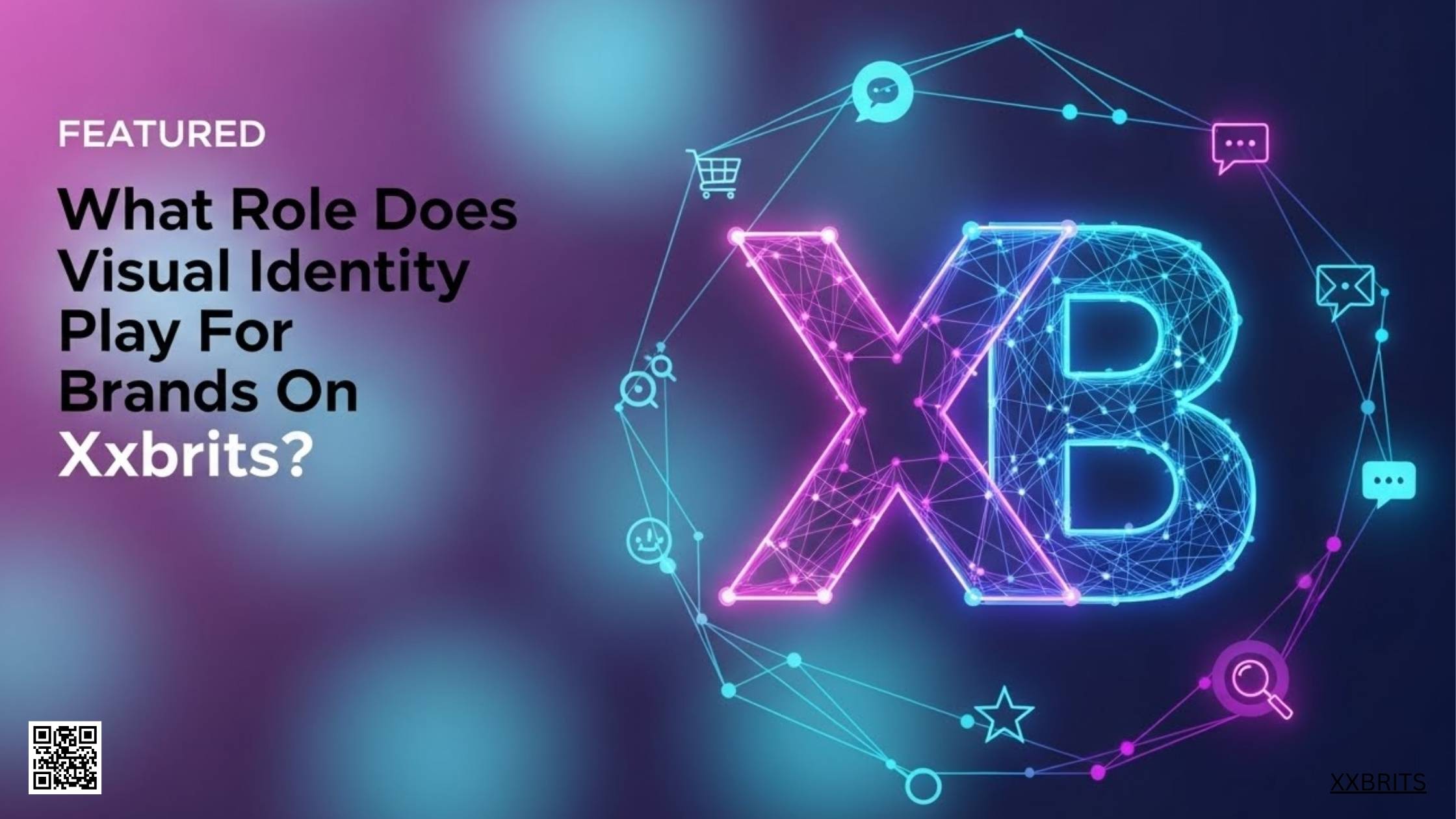
Visual identity on XXBRITS is the way a brand is recognised before a single word is read or spoken. It is how colours, styling choices, filming style, clothing presentation, and overall on screen consistency signal who a brand is, what it stands for, and whether it feels relevant to a UK audience. In simple terms, it is the difference between being instantly familiar and being forgotten in seconds.
From our point of view, visual identity is not decoration. It is communication. On a fast moving fashion video platform, brands do not get time to explain themselves. The look has to do the talking.
This article breaks down how that works in practice, why it matters more on video led platforms than traditional channels, and how UK brands are shaping recognition and trust through visuals rather than slogans.
Why visual identity matters more on video first platforms
Video platforms compress attention. Viewers scroll quickly and decide in a moment whether something feels worth watching. That decision is rarely logical. It is based on what looks familiar, confident, and aligned with their taste.
On a platform built around short fashion videos, visuals act as a shortcut. They answer unspoken questions:
Is this brand British or global
Is it premium or everyday
Is it playful or refined
Is it made for people like me
These signals come from framing, colour tone, clothing styling, background choices, and how creators present themselves.
Unlike static websites or long form ads, there is no room for lengthy brand explanations. The look must carry meaning instantly.
How visual cues shape trust before messaging
Trust online is visual long before it is verbal. People often decide whether to believe a brand based on how polished or coherent it looks.
On fashion video platforms, trust is built through repetition of recognisable elements rather than claims.
For example:
- Consistent lighting that makes products look true to life
- A stable colour palette that appears across different creators
- Similar filming angles that feel deliberate rather than random
- Clothing shown on real bodies rather than abstract mockups
These cues tell viewers that the brand is serious, present, and reliable without saying so.
When visuals change too often or feel mismatched, it creates doubt even if the product itself is solid.
The role of consistency across creators
One challenge brands face on creator led platforms is control. Multiple creators means multiple filming styles, body types, spaces, and interpretations.
Strong visual identity solves this by setting clear but flexible boundaries.
Instead of forcing uniformity, successful brands define a visual range. Think of it as a shared language rather than a script.
This often includes:
- Preferred colour tones for clothing and backgrounds
- Guidance on lighting such as natural daylight over harsh indoor light
- Framing rules like mid shot versus close up
- Movement style such as slow walk throughs rather than jump cuts
When different creators work within these boundaries, content still feels human while staying recognisable.
Colour psychology in UK fashion branding
Colour plays a major role in how British audiences read fashion brands. Cultural expectations matter.
Muted tones often signal quality and restraint
Bold colour blocks suggest youth and trend focus
Neutral palettes lean towards timeless and minimalist styles
UK brands that understand this use colour carefully rather than loudly.
For instance, a streetwear label might repeat greys and blacks with one accent colour. A womenswear brand might use soft pastels consistently across videos. Over time, audiences associate those colours with the brand even when the logo is absent.
This matters because logos are often small or skipped entirely in short form video.
How styling choices communicate brand values
Clothing presentation is not just about the item itself. It is about context.
A jacket filmed in a clean studio sends a different message than the same jacket worn on a city street. Neither is better, but each signals a different brand stance.
Styling decisions communicate:
- Who the clothing is for
- When it should be worn
- How confident the brand is in its product
On platforms like TikTok and Instagram, brands that rely on creators often lose control of this message. On XXBRITS, brands that succeed usually provide clear styling direction to creators while allowing personal expression.
Framing and camera movement as brand signals
Most viewers do not consciously analyse camera work, but they feel it.
Slow steady shots feel thoughtful and calm
Handheld movement feels raw and immediate
Close ups create intimacy
Wide shots create lifestyle context
Over time, these patterns become part of a brand’s identity.
For example, a brand that always uses slow pan shots and mid frames starts to feel composed and confident. Another that uses quick cuts and close ups may feel energetic and trend driven.
These choices should match the product and the audience rather than current platform trends.
The importance of background and setting
Backgrounds are not neutral. They carry meaning.
A white wall suggests minimalism
A bedroom suggests relatability
A studio suggests control
A street suggests authenticity
UK audiences are particularly sensitive to setting. Overly polished visuals can feel distant. Overly casual visuals can feel careless.
Brands that perform well often balance realism with intention. A clean but lived in space. A city street without clutter. A home setting with controlled light.
These decisions support the brand story without distracting from the clothing.
How repetition builds recognition over time
Recognition does not come from a single viral video. It comes from repetition.
When audiences see similar visual patterns again and again, their brain links them together. This happens even when the viewer cannot name the brand yet.
Over time, this leads to:
- Higher watch time because content feels familiar
- Less resistance to branded messaging
- Faster recall when the brand appears again
This is especially important on platforms where users follow creators rather than brands directly.
Visual identity versus logos on creator platforms
Traditional branding relies heavily on logos. Creator platforms do not.
Logos are often cropped out, covered by interface elements, or ignored entirely. Visual identity fills that gap.
Instead of a logo, brands rely on:
- Colour repetition
- Styling patterns
- Creator selection
- Filming approach
This is why brands that insist on heavy logo placement often struggle on video platforms. It interrupts the natural flow of content.
Read: What Makes Xxbrits Fashion Content Different From Other UK Style Platforms?
The role of creators as visual extensions of the brand
Creators are not just messengers. They become part of the brand image.
The way they speak, move, dress, and present themselves influences how the brand is perceived.
Smart brands treat creator selection as a visual decision as much as a reach decision.
Questions brands should ask include:
- Does this creator’s style match our clothing tone
- Does their filming style align with our visual language
- Does their audience overlap with our desired image
When creators fit visually, content feels natural. When they do not, even high engagement can fail to convert.
Case style example: emerging UK fashion labels
Many emerging UK labels start with strong product ideas but weak visual direction. Their early content often looks inconsistent.
Those that grow usually do three things:
First, they define a narrow visual range rather than trying everything
Second, they work with a small group of creators repeatedly
Third, they review past content to identify what feels most on brand
Over time, their feed begins to look cohesive even though it features different people.
This cohesion is often what attracts partnerships and repeat creator interest.
How visual identity supports long term brand equity
Short term attention comes from trends. Long term growth comes from recognition.
Visual identity supports brand equity by making content easier to recognise and trust over time.
This matters because:
- Acquisition costs rise as platforms mature
- Paid reach becomes less reliable
- Organic discovery depends on memory
When people recognise a brand visually, they are more likely to stop scrolling, watch longer, and click through when ready.
Metrics influenced by strong visual identity
While visual identity feels subjective, it influences measurable outcomes.
Brands with consistent visuals often see:
- Higher average watch duration
- Lower bounce rates on profile visits
- Better creator retention
- Higher conversion from repeat viewers
These metrics matter more than one off viral spikes.
Balancing platform trends with brand identity
Every platform has trends. Filters, music styles, editing patterns change constantly.
Brands that chase every trend risk losing their visual core. Brands that ignore trends entirely risk appearing out of touch.
The balance lies in adapting trends to fit existing visual rules rather than rewriting them.
For example, using a trending sound but keeping the same framing and styling. Or using a popular format while maintaining colour consistency.
This allows relevance without confusion.
Visual identity and audience segmentation
Not all audiences read visuals the same way.
Gen Z tends to prefer rawness and relatability
Millennials often prefer clarity and polish
Niche fashion audiences look for detail and fit
UK brands that understand their target audience adjust their visual language accordingly while staying within their defined identity.
This avoids trying to please everyone and instead builds a loyal core.
The role of thumbnails and first frames
On video platforms, the first frame acts as a thumbnail.
Strong brands design that moment intentionally.
This might include:
- A clear view of the clothing
- A recognisable colour block
- A consistent opening pose
This increases the chance of stopping the scroll without relying on text hooks.
Visual storytelling without words
Some of the most effective brand content uses minimal or no spoken text.
Movement, expression, styling, and environment tell the story.
This is particularly powerful in fashion where fit, texture, and movement matter more than explanation.
Brands that rely too heavily on captions often miss this opportunity.
How visual identity reduces reliance on paid ads
When organic content is recognisable, paid promotion becomes more efficient.
Audiences who have seen the brand before are more likely to respond to ads. Visual familiarity lowers resistance.
This means that visual identity does not just support content. It supports performance marketing too.
Common mistakes brands make with visual identity
Several patterns repeatedly hold brands back.
Changing style too often
Copying competitor visuals without adaptation
Ignoring creator filming quality
Overusing logos
Following trends without alignment
Avoiding these mistakes requires discipline rather than budget.
Practical checklist for brands on XXBRITS
For brands reviewing their visual presence, these questions help clarify direction.
- Do our videos look related even when different creators post them
- Can someone recognise our content without seeing the name
- Are our colours consistent across uploads
- Does our styling reflect our price point
- Do our backgrounds support or distract from the clothing
If most answers are no, visual identity likely needs attention.
Visual identity as a long term asset
Visual identity compounds. Each consistent piece of content strengthens the next.
It does not guarantee immediate results, but it builds familiarity, trust, and recall over time.
On platforms where attention is brief and competition is constant, that familiarity becomes one of the few durable advantages brands can hold.
Closing thoughts
From our perspective, visual identity is not about perfection or polish. It is about clarity.
On XXBRITS, brands that succeed visually do not shout. They repeat. They refine. They let their look do the work before words ever appear.
In a space driven by movement, faces, and style, the strongest brands are the ones viewers recognise without needing to be told who they are.